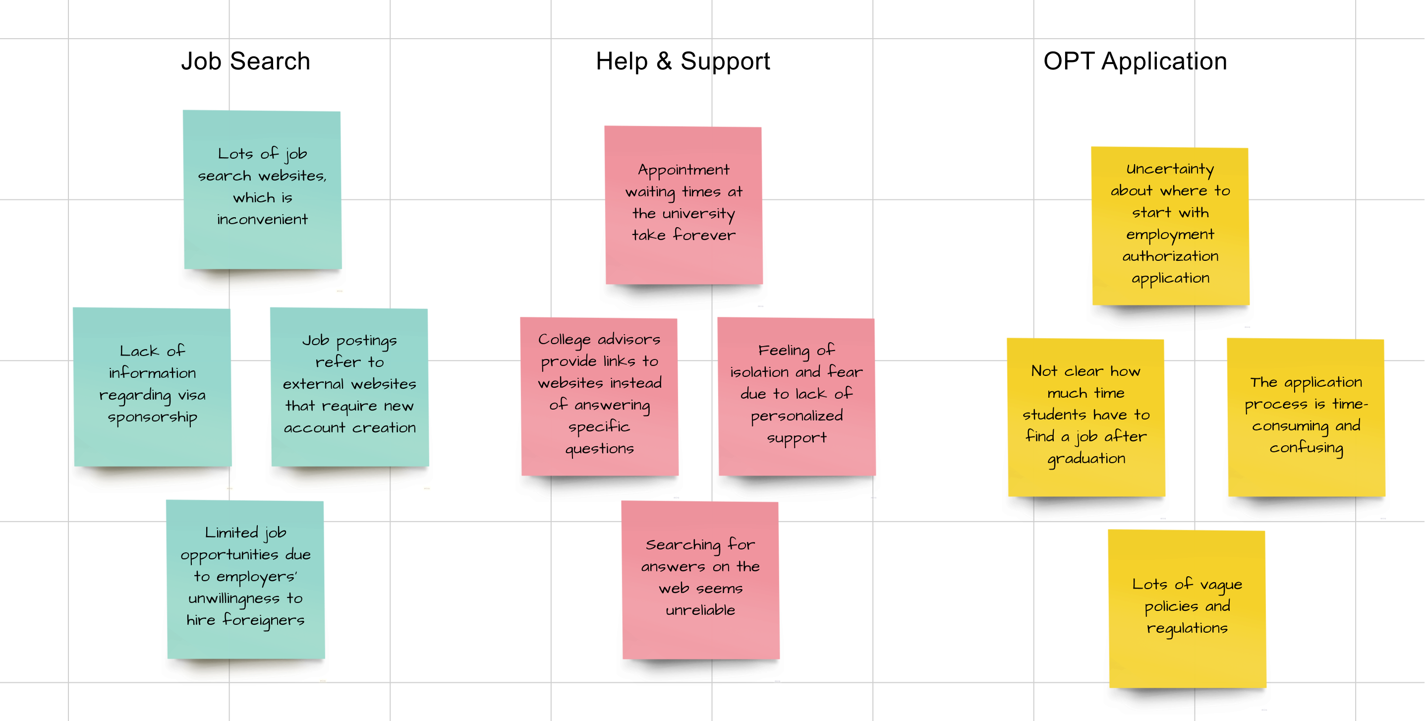
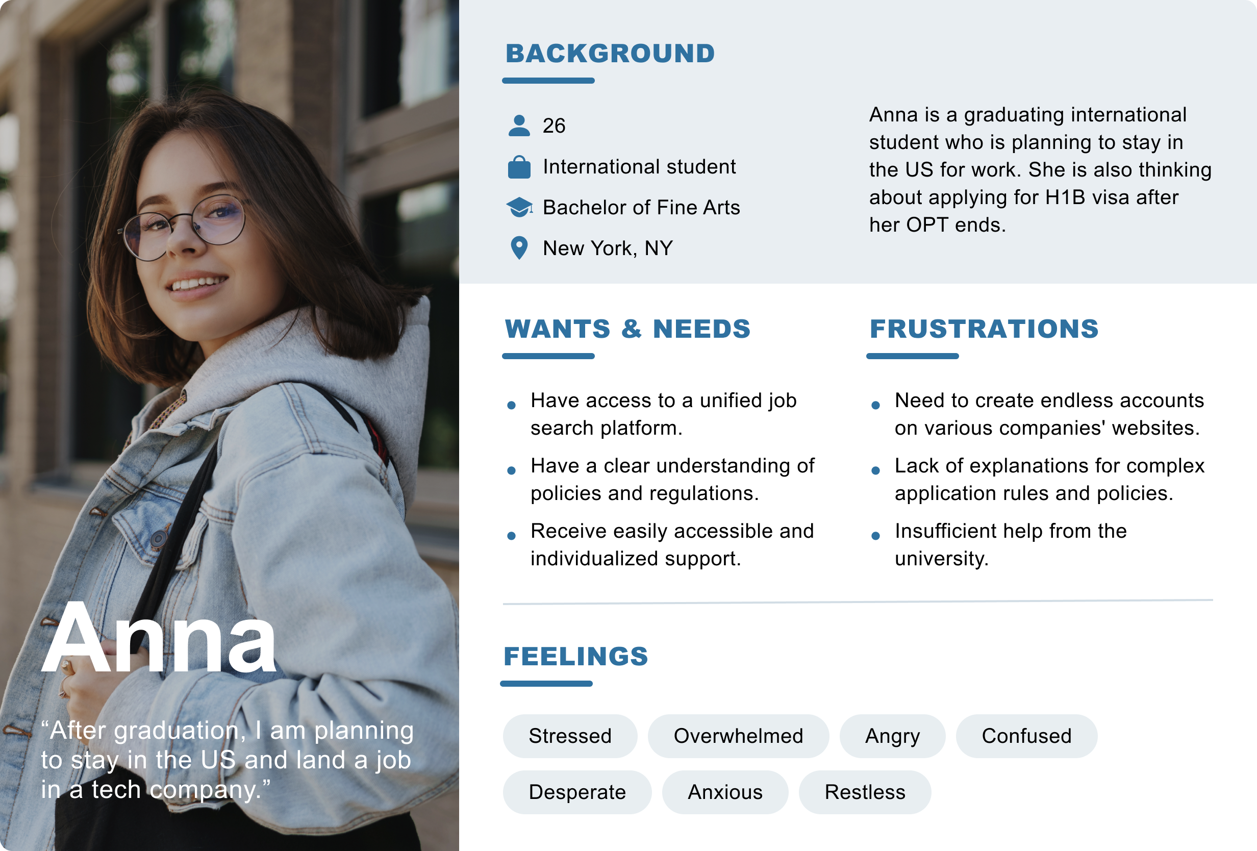
"I don’t know where to start with my application and the school isn’t helping at all!" — Tim C (student).
Overview 📌
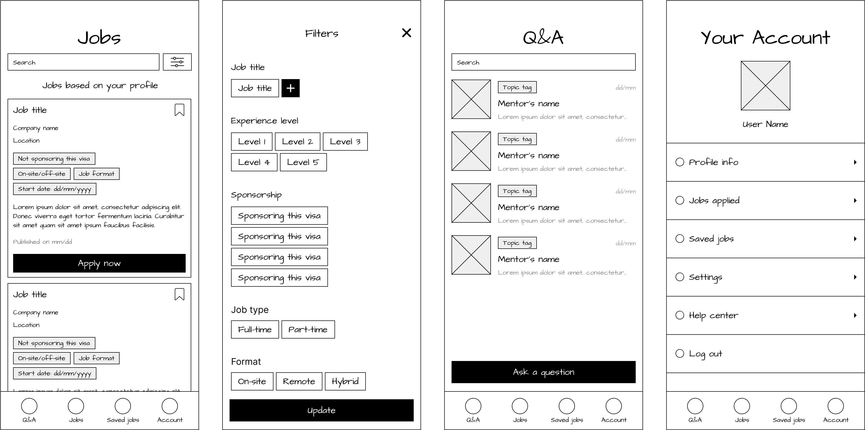
MOBILE APP
challenge
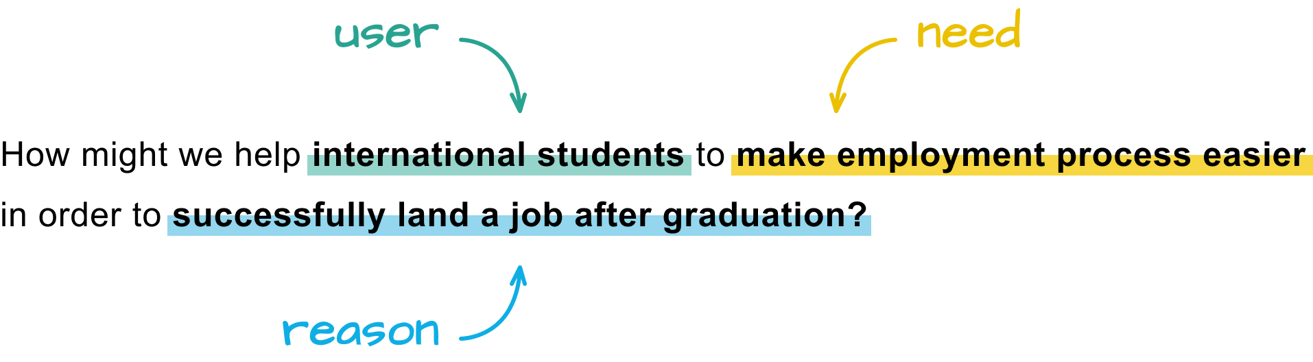
According to NSF, 77% of international students expressed intent to remain in the United States and work after graduation. However, only 46% were able to do so. How might we empower international students to confidently pursue career opportunities and increase their chances of successful employment?
goals
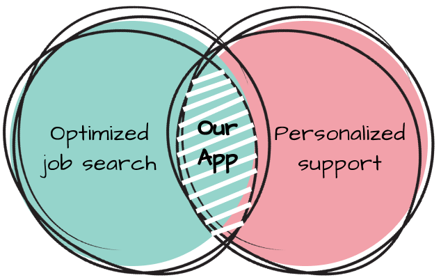
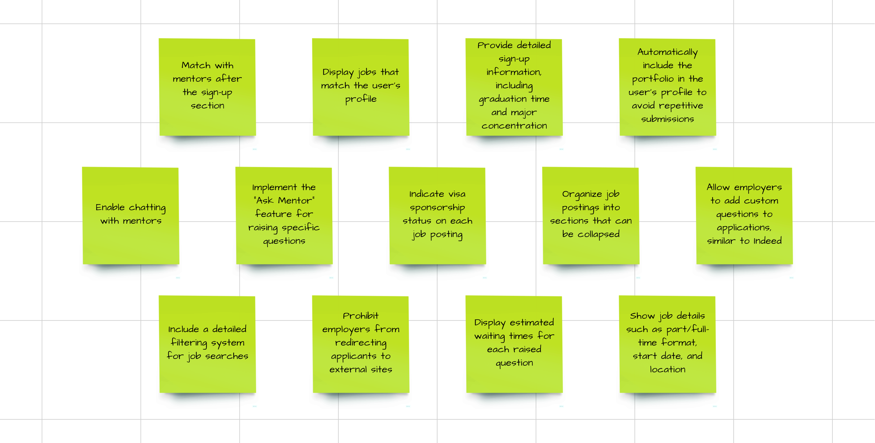
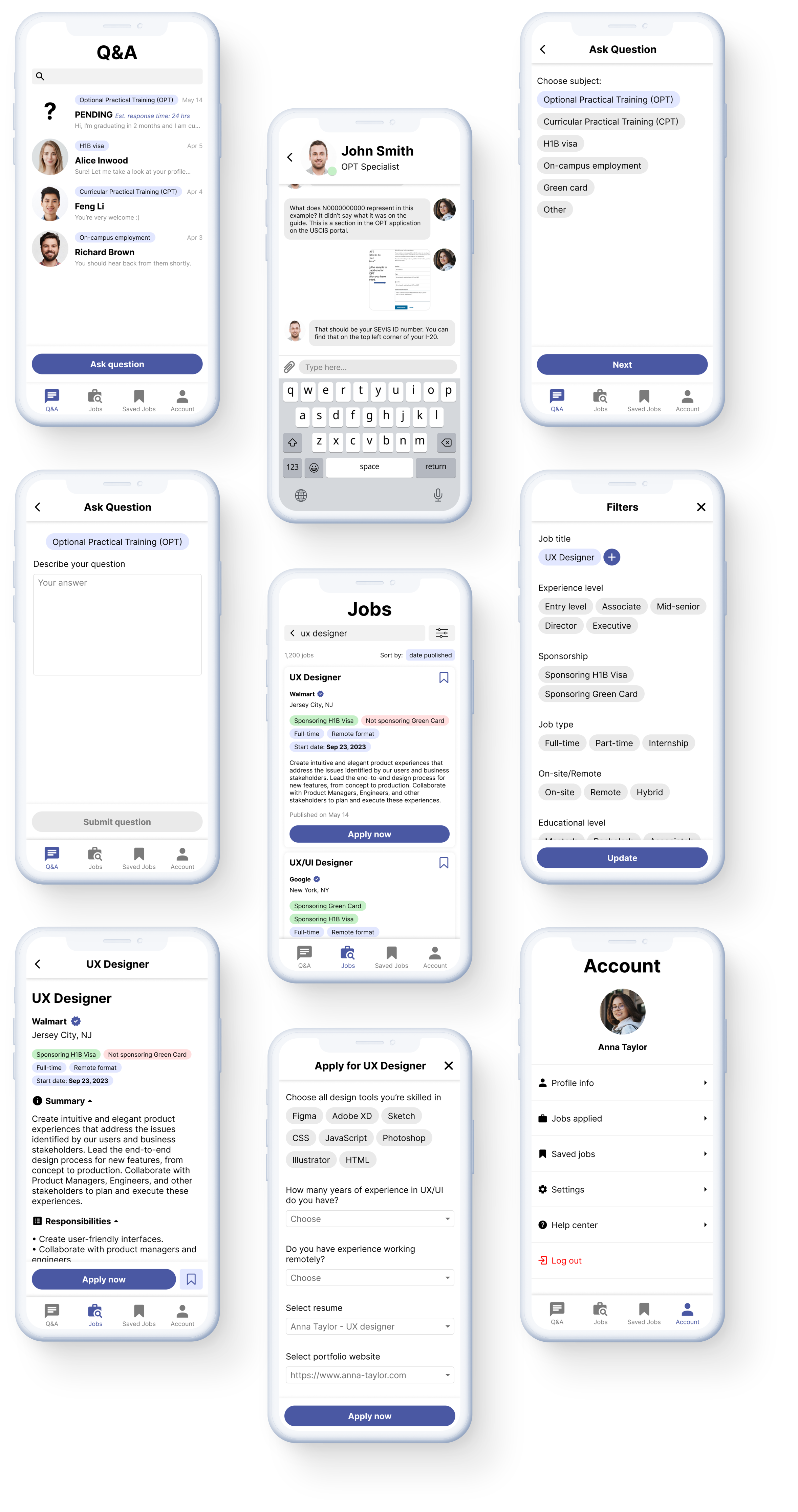
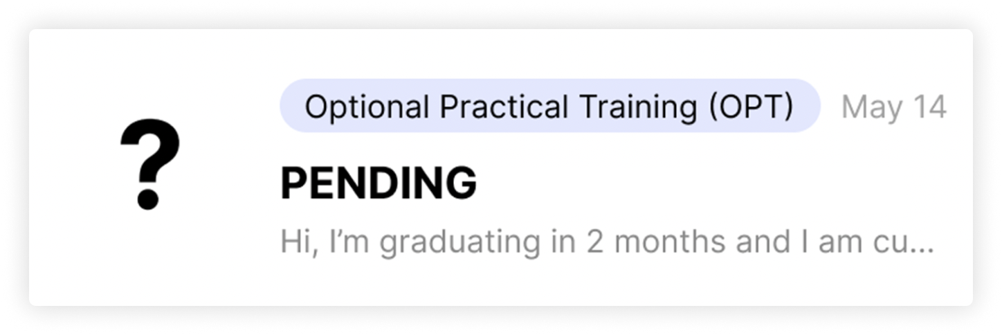
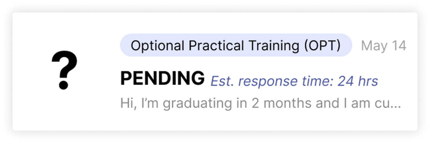
• Offer mentorship and support for international students regarding employment, paperwork, and job applications.
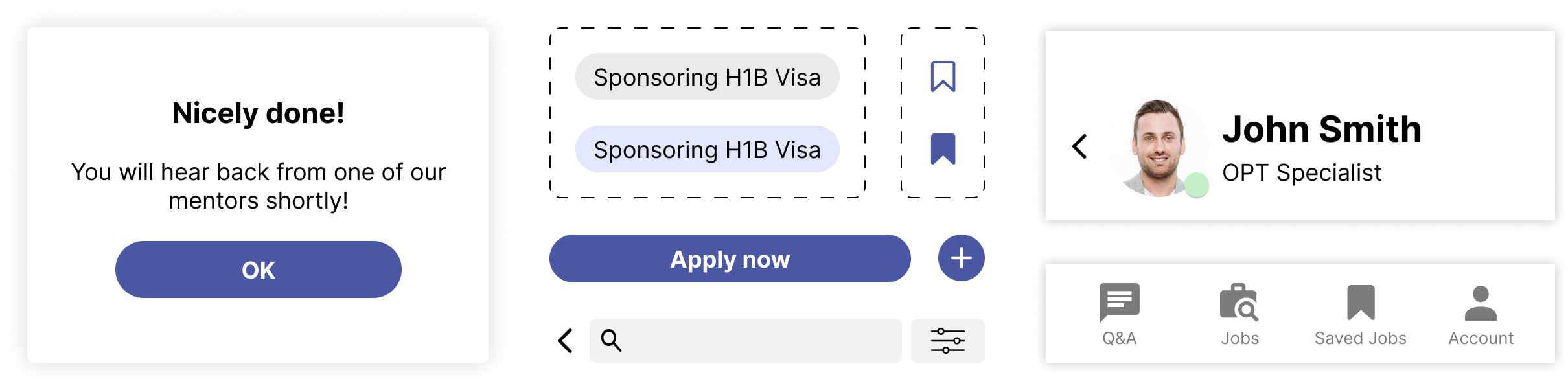
• Make job search based on hiring policies transparency.
• Build a user-friendly platform that ensures a less stressful job search process.
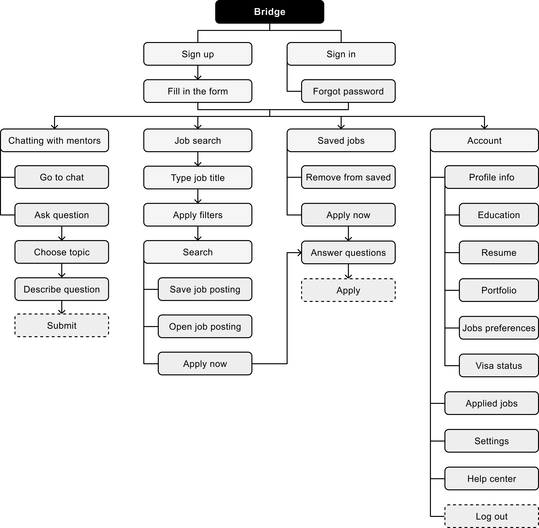
my role
I collaborated closely with another Product Designer throughout the entire process, actively participating in tasks ranging from conducting research and generating ideas to developing style guide flows and crafting final UI designs.